│
What is each direction on the picker adjusting? Jump to that explanation here.
If you're just looking for the results, below is a custom color picker based on the color space written in Javascript and a sample procedural generation algorithm in Python (Javascript equivalents are in the page source) - feel free to take this math and go have fun depicting our diverse world!
The goal of this project was to define a color space that makes it easier to build inclusive color tools for a variety of contexts - such as character creators or digital art. If you see something here that sparks your curiosity, I would love for you to stick around and read below this section to learn more!
# Plug the output of one of the select_point implementations into to_rgb(t, u, v)

def select_point(r_square: float = 2.) -> tuple[float, float, float]:
    """Uniformly sample from the sphere deterministically"""
    radius = r_square ** (1. / 2)

    phi = uniform(0, 2 * math.pi)
    costheta = uniform(-1, 1)
    n = uniform(0, 1)

    theta = math.acos(costheta)
    r = radius * (n ** (1.0 / 3))

    t = r * math.sin(theta) * math.cos(phi)
    u = r * math.sin(theta) * math.sin(phi)
    v = r * math.cos(theta)

    return (t, u, v)

def select_point(r_square: float = 2.) -> tuple[float, float, float]:
    """Uniformly sample from the sphere using rejection sampling"""
    radius = r_square ** (1. / 2)
    R = radius + 1

    while R > radius:
        t = uniform(-radius, radius)
        u = uniform(-radius, radius)
        v = uniform(-radius, radius)

        R = (t**2 + u**2 + v**2) ** (1.0 / 2)

    return (t, u, v)

def to_rgb(t, u, v) -> tuple[int, int, int]:
    x = (t - 0.15) / 0.45
    y = (v - 1.2 * t ** 2 + 0.2 * t + 0.655) / 1.84
    z = u / 3.6

    r = 28.77438370854 * x + 36.78307445559 * y - 19.69766918644 * z + 187.1436241611
    g = 35.38327306318 * x - 2.009931981182 * y + 47.93462563172 * z + 137.1073825503
    b = 36.14733717939 * x - 43.54346996173 * y - 28.50821294135 * z + 108.2241610738

return int(r), int(g), int(b)What colors are we? The short answer is maybe something like “brown” and the long answer is very, very long. Representing the broad range of human skin tones digitally is a hard problem. Often, a limited set of colors is presented as being good enough to cover the full spectrum of diversity. However, in using a specific set of colors, large groups of people are unable to accurately be represented, or might be unintentionally excluded.
The goal of this work is to identify the broadest inclusive range of colors in the RGB color space that correspond to plausible, but simplified skin tones. In particular, the aim was to identify simple, “good enough” equations which define that area, allowing the range to be used in a variety of contexts. Calling the equations "good enough" is intended to keep the limitations of this work at the forefront - the results are a useful starting point, but should not be taken to be authoritative.
Although there have been improvements in the set of colors that are presented as representative of us, there's still a gap that needs to be closed. Emojis say we're 5 shades (or cartoon-yellow); a makeup brand might say 50; and a character creator might shrug and tell you to pick from all 16,777,216 options. If you look outside - or just at yourself - you'll quickly notice that none of those can compare to the variety of reality; one person is not just one color. Despite that, it can be useful to try to boil things down to fewer values. The Unicode Consortium and makeup companies can figure out their own ranges, but I believe we can find a better solution that's somewhere between "several" and "several million."
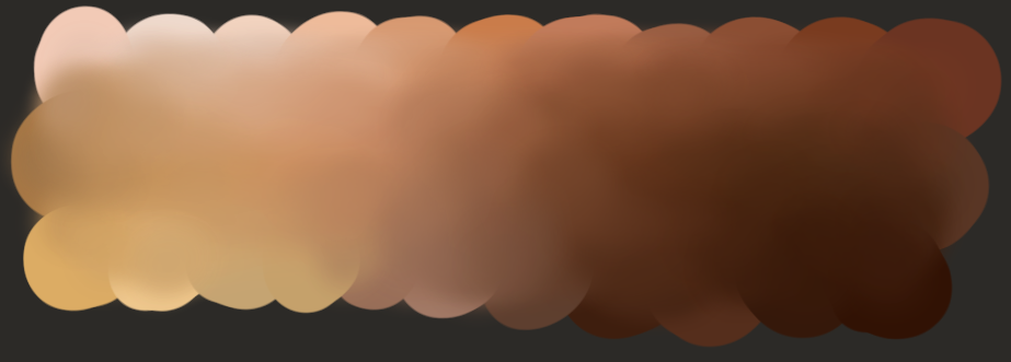
Taking the digital art world as an example, images such as the one below are often circulated in an attempt to assist other artists in identifying plausible colors.
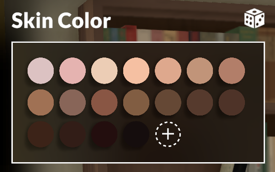
In the video game world, nowadays the preset colors are often wide ranging and supplemented with a general color picker, but it would be even better if the initial experience presented better options.
Taking a step back to reality, this work has a number of inherent limitations.
As mentioned before, skin tones are much more complicated than a single color. They vary widely between different areas of the body and are subject to complex biological processes. The perceived color of the skin is affected by blood flow, concentrations of melanin, complex scattering of light through the layers of the skin, as well as things like vitiligo, freckles, hyperpigmentation, scarring, and other common variations.
Secondly, a variety of health conditions can cause people to have skin tones that are well outside what might be perceived as plausible. Argyria can often lead to skin that is blue-gray in color; high bilirubin can cause skin to be yellowish or greenish.
Additionally, it's important to note that I am one person, not a researcher, and subject to my own general biases on top of my own perception of color. As far as I am aware I don't have color vision deficiency, but a lot of the choices I made are completely subjective.
Finally, colors are not perceived consistently across display types and viewing environments. RGB values look different between different screens, and people look completely different under different lighting conditions.
Broadening this work to address some of these limitations would be an interesting area of further investigation - a goal of this project was to be good enough for simple use cases, but these limitations might be more problematic in other contexts. The results here will mainly be applicable in contexts that relate to generating simplified representations of people.
What are all of those numbers, and how did you get them?
Content warning - unscientific methodology below. In other words: good enough is fine if you're an engineer.
Summary:
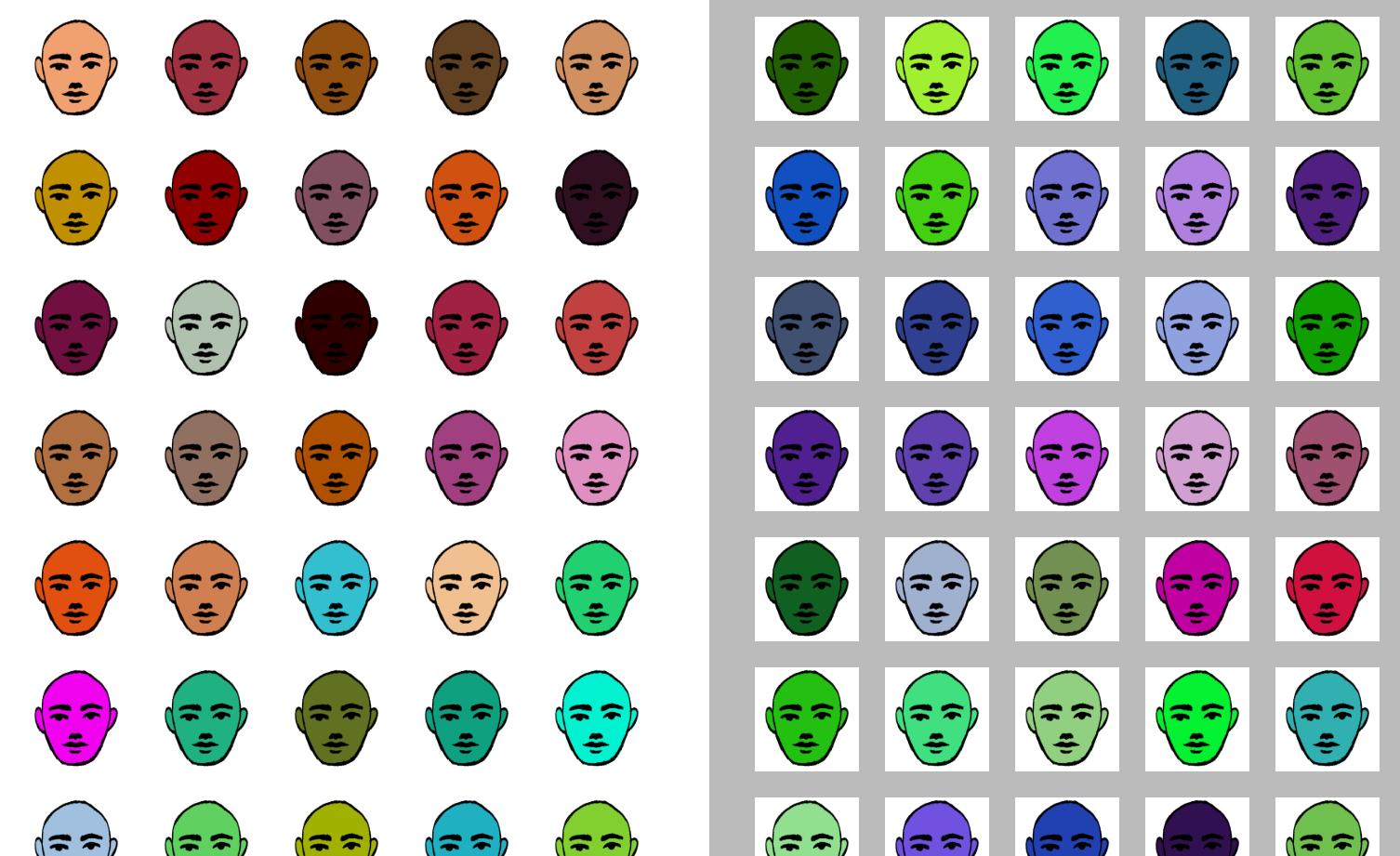
Sometimes the best place to start is by doing a ton of tedious work. I didn't label every color in RGB, but there certainly were a lot. This is the UI I built for labeling - just a simple webpage where you click to move a face between the yes and no side. Initially they were just squares, but I ended up drawing a face and slapping the colors onto it. Gazing into my lumpy research assistant's eyes made it much easier to quickly go “yeah I can imagine that person walking around”.
Graphing that data, you get the following shape - for visualization it's kind of like a banana shape that swoops between 0, 0, 0 and 255, 255, 255. The curve is more towards red and away from blue.
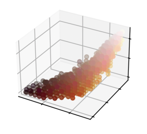
This is where I got stuck for the longest. For your sake, I'm going to skip over all of my dead ends and struggles along the way. There were many. Far too many. Things involving convex hulls, regression misadventures, 4th degree polynomials, and the worst looking code I've ever written.
The result of all of that was that I decided I needed some way to transform the shape into something easier to work with: that's when I learned about principal component analysis and was immediately inspired.
Although all of the math and technology here is fun, it's important to address the fact that technology exists in a social context. Stating things plainly: lighter skin colors have both presently and historically been celebrated and prioritized while darker skin colors have been marginalized and maligned. Racism and colorism are systemically present in many cultures, in both overt and subtle ways.
Below are some great videos, essays and projects that address these issues through a variety of lenses. I highly recommend taking a look, especially if you want a break before we get into the math.
In her video series The Darkest Shade, Nyma Tang reviews the darkest shades from a variety of makeup brands. In her own words, "It's important for makeup brands to make products for all shades and as someone with a darker skin tone, I want to be able to help others who struggle to find the same!"
In a similar vein, Kat Blaque's video (for introspective hot people) Youthforia's Blackface Foundation is about a makeup brand that released a dark shade that was literally black - far darker than what would be plausibly useful.
The article Beauty Brawl by Jason Li systematically measures how inclusive a variety of beauty brands are with some really slick data visualizations. And this notebook by Max Bo takes that analysis even further, with one graph even resulting in a similar crescent shape to the labeled data.
Finally in the makeup space, the Vox video How beauty brands failed women of color talks about the history of discrimination in the beauty industry and the limited availability of deeper shades. There's a lot of great expert interviews as well as a discussion of the intersection with Black history.
Taking a look at video games, Me, On The Screen: Race in Animal Crossing: New Leaf by Austin Walker is an excellent essay about the author's struggle to see himself represented in video games. In the years since, Animal Crossing has gotten much better about inclusivity but the essay also goes into his history of not seeing himself - or seeing characters that look like him be stuck in racist tropes.
The Humanae photography project by Angélica Dass is "an unusually direct reflection on the color of the skin, attempting to document humanity's true colors rather than the untrue labels “white”, “red”, “black” and “yellow” associated with race." In a way it's really similar to the work here - except with a focus on documenting and conversing instead of describing, and using Pantone shades over hex codes.
For more direct resources, the video It's not a Coincidence. It's Colorism. by Tee Noir gives a description of what colorism is, and a few ways it manifests in modern pop culture.
Finally, Writing With Color is an excellent blog with many resources about writing various kinds of diversity. The blog is run by a team with expertise in many different areas, and they often take reader questions. In particular I found their post Words for Skin Tone | How to Describe Skin Color really interesting. As more of a reader than a writer, it's fascinating to see behind the scenes on how to make better word choices.
Briefly, principal component analysis (PCA) is a way to rotate and stretch a dataset so that the main directions of variation lie along the axes of the coordinate system. To make that more concrete - recall the banana shape of my dataset from before. In its original form, the banana was sort of floating in space. PCA took that shape and placed in on the ground so that it was symmetrical about the axes and aligned nicely. It also did some slight stretching and rescaling, but that's less important.
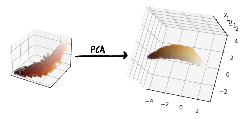
Aside from the modified dataset, another output of the analysis is a matrix that can be used to take a point from RGB space and translate it into the resting-on-the-floor space. I refer to this as PCA space. I use the variables X, Y, and Z for it, but the space is not to be confused with CIE XYZ space.
To summarize what we've done so far: we started with data in RGB space (the manually labeled dataset). PCA gives us a way to take points in that space and transform them into another space - the PCA space.
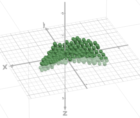
Now the goal is to fit some function to all of these points. Because it's a dense shape, if we can define the surface of it with an equation, we can modify that equation to include the points on the inside as well by switching the equation to being an inequality (eg from x² + y² + z² = 2 to x² + y² + z² ≤ 2).
The process for fitting the function is as follows:
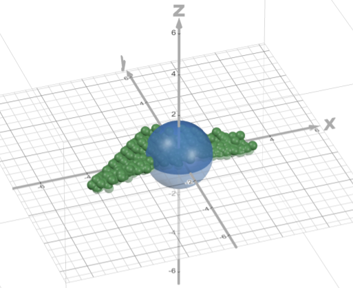
If you have (t = x, u = y, v = z) as a starting point, you can start to play with those relations until you start to get an intuition for how changes to the equations will end up shifting your sphere around.
So I did that! A lot. To put it plainly - I manually fit functions to my target cloud of points. There is no regression here, I literally did guess and check and eyeballed the function fit. I did this in Desmos 3D - if you haven't used Desmos in a while it's amazing how good it was for this.
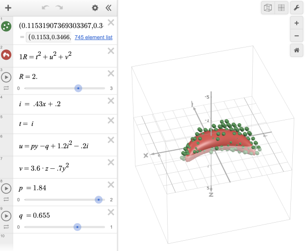
The functions that relate (t, u, v) to (x, y, z) can be used to translate a point between those two spaces. Principal component analysis gave us a way to move between RGB and the PCA space, and then these new equations give us a way to move between the PCA space and TUV. Linking up all the transformations gives us the functions that take us between TUV to RGB.
Am I endorsing this methodology? No. But also kind of. In this specific situation it's what worked to get it done and get functional equations. It would be great to see someone do this properly, with nice clean symbolic regression and really good training data. But I figured since the training data I labeled was middling quality at best, I'd probably have a better time using my guess and check and then eyeballing the results.
And all that being said, I think I would endorse the overall method I used, if not the specifics. That being "Label Data" → "PCA" → "Fit A Spherical Equation".
From the equations, the sample code at the top of the page is just a short translation away. The next section is the description of the components of the Picker UI, which also serves as an explanation of what TUV space actually looks like, and what properties it has.
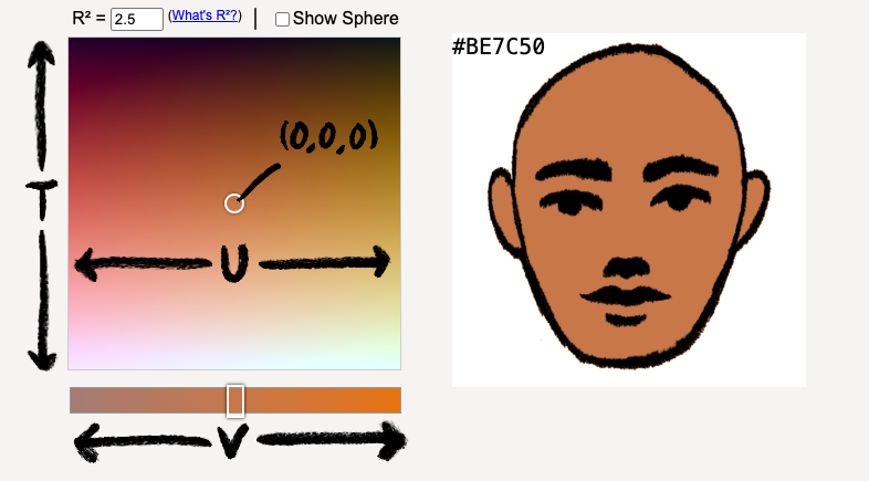
Just like how a typical color picker allows you to adjust red, green and blue values (or hue, saturation and value), this color picker also has 3 independent values to adjust - referred to in the code samples as T, U and V.
| Component | Aspect | Variable Name |
|---|---|---|
|
Up/ |
Deep/ |
T |
|
Left/ |
Flushed/ |
U |
|
Left/ |
Cool/ |
V |
What's really interesting about these controls is that the concept each is adjusting is completely an output of the principal component analysis. Or in other words, I didn't know that these would be what the directions controlled until after I had made the picker. It's a really neat demonstration of what principal component analysis does - it rotates data to maximize how meaningful each axis is.
Now, if you're experienced with color spaces you might be thinking that this looks a lot like HSL/HSV. However, when I was doing my first experiments with the labeled data those color spaces didn't quite capture what I was looking for. I think in particular that although T and U seem similar to Value and Hue, they don't completely match up. And the biggest difference is between V and Saturation. V ranges from blue to orange, while Saturation would look more like gray to orange; although at some (T, U) values V might look a lot like Saturation, overall it doesn't quite correlate.
What is R²? R² is the radius of a sphere in the skin tone color space. Because one of the steps of translation from RGB to TUV involves a sphere, it makes spheres a natural shape to work with in TUV space. A lot of the cool properties that arise from that fact are just a side effect of spheres having a lot of useful properties.
To start with a visual, below is a table of R² values, and the result of using a sphere with that value:
| R² | Description | Sample |
|---|---|---|
| 0.1 | Almost no variation | |
| 0.5 | Minor variations | |
| 1.0 | Minimum value to have decent variety when randomly picking | |
| 1.5 | Good variety while maintaining realism | |
| 2.0 | Potentially cartoonish - random selection will have occasional outliers | |
| 2.5 | Randomly selecting in this range might give unexpected values, but useful in a picker UI | |
| 10 | Maybe something for a fantasy setting? | |
So what's going on with that table? Because a sphere is defined by a radius, you can define useful sampling ranges using only a single value and then easily select points from within that sphere. For example, in the sample implementation of the tone generation function I use a radius of 2. This is the radius that was used when developing the color space and generally will result in a broad range of tones. However, if you find there are implausible results generated using that radius you can decrease it by a bit in order to reduce the variation in generated colors.
The fact that the sphere shrinks along a radius means that the reduction in variation actually does not result in a large reduction in representativeness. In other words, reducing the radius doesn't lead to just chopping off deep or fair skinned colors - deep skin tones, fair skin tones, flush skin tones, ochre skin tones, cool skin tones and warm skin tones are uniformly decreased in variation.
Taking R² all the way down to 0, we can identify the origin of the color space. If the space is well formed then this origin point should be a very neutral ambiguous tone. If the origin seems biased in a particular direction, then that would indicate that the space needs more fine tuning. Essentially, the origin point can be used to identify bias in the space mapping.
At the other extreme, you can increase R² in order to allow for more variation. As an example, I do this in the color picker UI. In a picker UI the user can ignore implausible colors, so there's little issue with increasing the variation too far. In a color generation context you'd likely want to avoid having implausible colors popping up. There is likely not an ideal R² value that works in all contexts, but having a single parameter to tweak makes it easy to adjust the equations to your needs.
We have a color space, we have a picker for it, we have a procedural generation algorithm, and we have a methodology for creating new spaces or modifying the existing one. Overall, I'm thrilled with this result. It's certainly not perfect, but I don't think a simple and completely correct solution exists. I've already used the picker in a digital painting and it was exactly as I was hoping it'd be - and I'm looking forward to using the generator in my next projects.
First is feedback: if you at all found this interesting or useful, please let me know! Although I did this work for my own use, hearing from others is also so rewarding. Also please reach out with any questions or feedback - especially if you spot something I didn't think about.
Although I would love to post an email address for accessibility, I think the safest solution is to use the issues page of the repo for this project to contact me. But open to suggestions on alternatives for that as well!
A task for me is to clean up my code and post it to the repo for this page to make it easy for people to recreate and iterate on this work.
In defining the color space so precisely and using specific R² values, there is a risk that some colors have been excluded or marginalized. However, that same concreteness also allows for extremely precise critiques of the color space, and therefore extremely precise improvements. As mentioned before, my process involved a lot of subjective eyeballing - a great iteration on that would be to have multiple people, perhaps experts, labeling data and then measuring the output more precisely against that.
A direction mentioned earlier would be to look into modeling simplified versions of various conditions. What modification might you be able to apply to base tones to simulate that person having jaundice, or argyria, or becoming pallid? What colors are freckles, vitiligo, scars, hyperpigmentation, or stretch marks relative to a person's base tone?
From a technical direction, making the equation generation more formalized is another potential direction to go. Starting with the shape of equations I manually determined, symbolic regression on those against better training data might lead to an even better color space definition.
There's also the potential for optimizing the equations for different contexts. I've chosen to write them out in code as they are to be the most readable to a broad audience. However, keen mathematicians might notice that one of those steps looks a lot like a matrix multiplication, which can be rewritten to be more efficient in certain contexts.
It might also be interesting to see what the results look like if you transform the data into another color space before doing the principal component analysis and equation fitting. There's a chance the equations end up being simpler or more representative. Because of the sphere, the shape of the surface in the color space you build from will be maintained and it will mainly scale with R² values. For an illustration of this idea, see the graph script in the repo's code.